Elevate Your Space: Exploring Home Color Schemes
Choosing the right color scheme for your home is more than just a design decision—it’s a way to transform your living space into a personal haven that reflects your style and enhances your mood. Different color schemes can evoke various feelings, create illusions of space, and highlight architectural features. Here, we explore various home color schemes and how they can elevate your space.
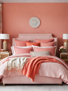
1. Monochromatic Color Schemes
Description: Monochromatic color schemes involve using different shades, tints, and tones of a single color. This approach creates a cohesive and harmonious look.
Benefits:
- Sophistication: A monochromatic palette can make your space look sophisticated and modern. For example, varying shades of blue can create a calming, serene environment.
- Simplicity: It simplifies the design process since you’re working within one color family.
- Focus on Texture: Without the distraction of multiple colors, textures and patterns become more noticeable, adding depth and interest.
Tips:
- Use different materials and textures to avoid a flat look.
- Incorporate contrasting elements like white trim or dark accents to create visual interest.
2. Analogous Color Schemes
Description: Analogous color schemes use colors that are next to each other on the color wheel, such as blue, blue-green, and green. These combinations are naturally harmonious and pleasing to the eye.
Benefits:
- Harmony: This scheme provides a serene and comfortable feel, ideal for spaces where relaxation is key, like bedrooms and living rooms.
- Flexibility: With multiple hues, you can create subtle contrasts and depth without straying too far from a cohesive look.
Tips:
- Balance the scheme with neutrals to prevent it from becoming overwhelming.
- Use the 60-30-10 rule: 60% dominant color, 30% secondary color, and 10% accent color.
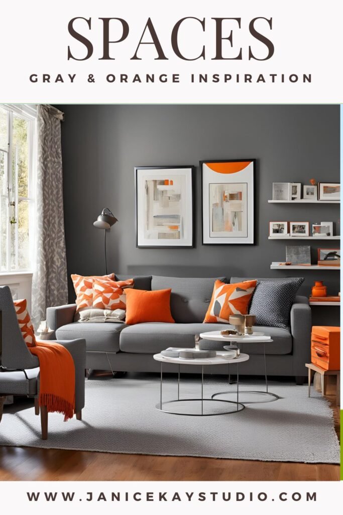
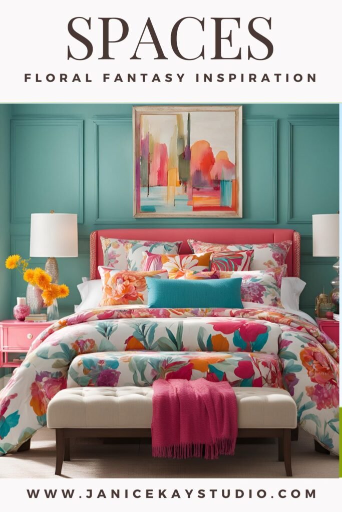
3. Complementary Color Schemes
Description: Complementary color schemes consist of two colors that are opposite each other on the color wheel, such as blue and orange. This combination creates a vibrant and dynamic look.
Benefits:
- Energy and Contrast: The stark contrast between the colors can energize a space and draw attention to specific features.
- Balance: When balanced correctly, these colors can make a room feel lively and balanced.
Tips:
- Use one color predominantly and the other as an accent to avoid visual clashes.
- Consider softer shades of complementary colors for a more subdued look.
4. Triadic Color Schemes
Description: Triadic color schemes use three colors that are evenly spaced around the color wheel, such as red, yellow, and blue. This creates a balanced yet diverse palette.
Benefits:
- Vibrancy: Triadic schemes are vibrant and lively, making them perfect for creative spaces like home offices or playrooms.
- Balanced Contrast: While the colors are contrasting, the even spacing maintains a sense of harmony.
Tips:
- Let one color dominate and use the other two for accents to maintain balance.
- Incorporate neutrals to ground the color scheme and prevent it from becoming too overwhelming.

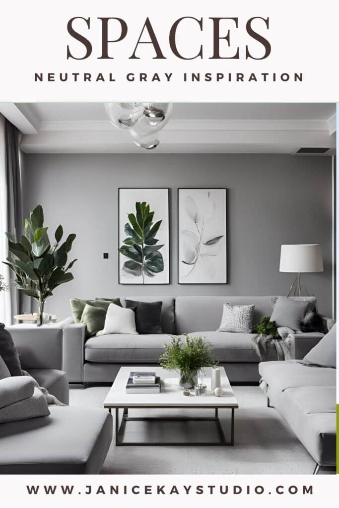
5. Neutral Color Schemes
Description: Neutral color schemes utilize shades of white, black, gray, and beige. These colors serve as a versatile backdrop for various design styles.
Benefits:
- Timelessness: Neutrals are classic and never go out of style, making them a safe choice for any room.
- Flexibility: They provide a perfect canvas for bold accessories and furniture, allowing you to easily change the room’s look.
- Light and Space: Light neutrals can make a room feel larger and more open.
Tips:
- Layer different shades and textures to add depth and prevent the space from feeling flat.
- Add pops of color through artwork, pillows, and rugs to keep the space lively.
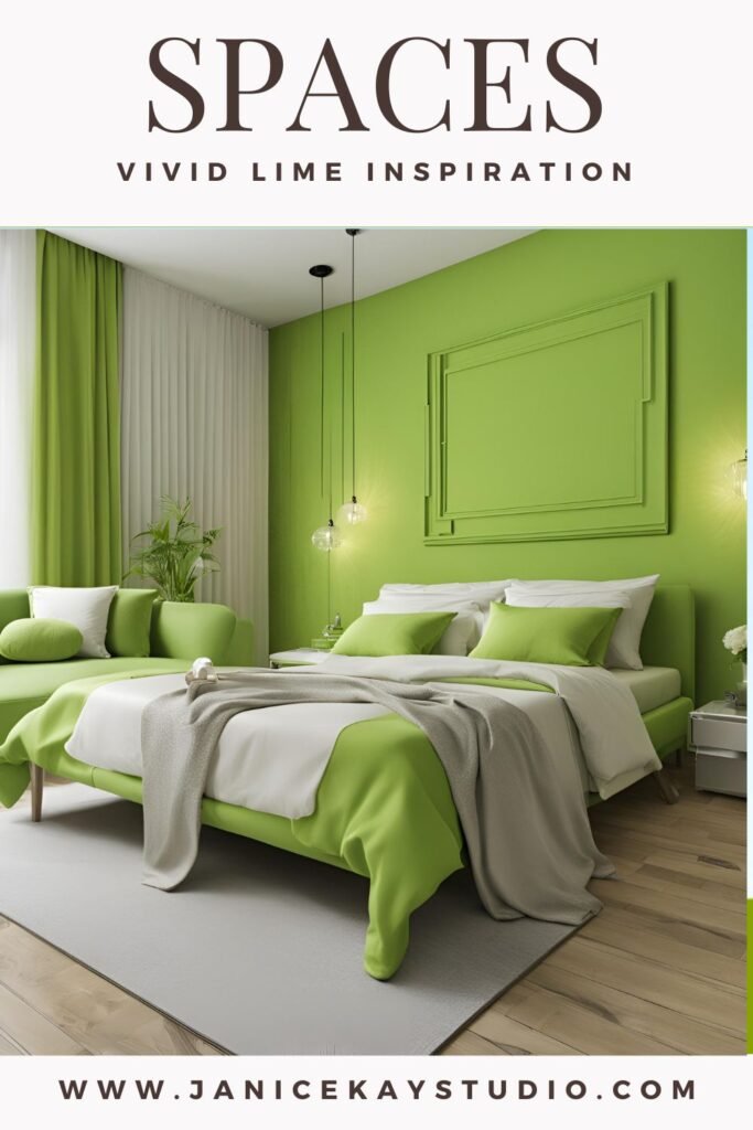
6. Warm Color Schemes
Description: Warm color schemes feature colors like red, orange, and yellow, evoking warmth and coziness.
Benefits:
- Inviting Atmosphere: Warm colors create a welcoming and cozy environment, perfect for social spaces like living rooms and dining areas.
- Energy: These colors can energize a room, making them suitable for spaces where activity and interaction are encouraged.
Tips:
- Use warm colors in rooms with plenty of natural light to enhance their effect.
- Balance with cool accents or neutrals to avoid overwhelming the space.
7. Cool Color Schemes
Description: Cool color schemes include blues, greens, and purples, often associated with calm and relaxation.
Benefits:
- Calm and Relaxation: Cool colors are perfect for bedrooms and bathrooms where tranquility is desired.
- Spaciousness: These colors can make a room feel more spacious and airy.
Tips:
- Combine with warm elements like wood and textiles to add warmth.
- Use varying shades and tints to create depth and interest.
Conclusion
Choosing the right color scheme can dramatically elevate your home, creating spaces that are not only beautiful but also functional and reflective of your personality. Whether you opt for a monochromatic palette for sophistication, a complementary scheme for vibrancy, or a neutral background for versatility, understanding how colors interact and affect your space will help you design a home that feels both cohesive and uniquely yours.